Tobias Stoll Open to work

Case study · Invia Flights · 2025 to 2026

Three moments that decide a flight booking

Three features for an online travel agency, each answering a customer's doubt at the moment it appears. All A/B tested, all measured against conversion.

  • Conversion ↑ high single digits
  • ~1 in 3 chose the Flex Ticket
  • 3 features · 3 platforms · all A/B tested
Role
UX/UI Designer in a design team, owner of these three features end to end
Product
Invia Flights: fluege.de and other flight booking brands
Platforms
Web, iOS, Android
Method
UX KPIs, A/B tests, session recordings

Context

Customers compare the same flight everywhere. Trust decides where they book.

Invia Flights is one of the largest online travel agencies in the German market, with brands like fluege.de and airline-direct.de on web, iOS and Android.

I owned three features at three points of the funnel. Each one answers a question that used to cost us bookings.

  1. 1 · Search results Offer Box "Is this the best offer, and is the member price worth it?" Conversion uplift · still live
  2. 2 · Booking Flex Ticket "What if my plans change?" ~1 in 3 chose it · conversion ↑
  3. 3 · Payment Price Guarantee "What if the price drops after I book?" Over a third booked it

1 · Search results

The Offer Box: from a push to an honest choice

"Is this the best offer, and is the member price worth it?"

Problem. The old card had one big button that selected the member price. The normal price hid in a small text link. Customer reviews on Trustpilot and drop-offs in the booking funnel, analyzed in session recordings and analytics, showed the cost: customers felt pushed.

Tension. Making the normal price visible could cost member sign-ups, and the Product Owner was concerned about that. So before designing, we agreed on bookings as the success metric and member clicks as the guardrail.

Hypothesis. If both prices carry equal weight, customers feel less pushed and book more, even if fewer pick the member price.

  1. 1 Earlier

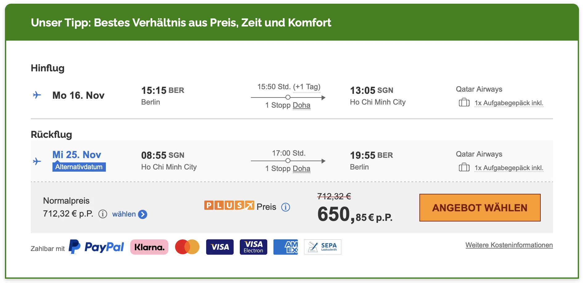
    Earliest offer card: a dark green 'Unser Tipp' banner, the normal price as a small link, and a big orange 'Angebot wählen' button next to the member price

    One button, one path. "Angebot wählen" picks the member price. The normal price is a small link.

  2. 2 Before my redesign

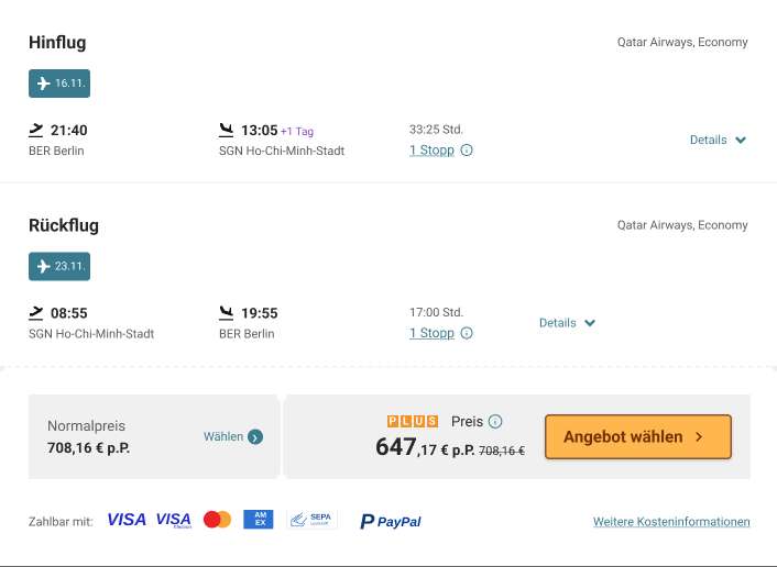
    Offer card before the redesign: outbound and return flight as separate blocks, normal price in a grey box with a small 'Wählen' link, member price with a big orange 'Angebot wählen' button

    Same push, more height. The big button still picks the member price, and the card grew taller.

  3. 3 My redesign · live today

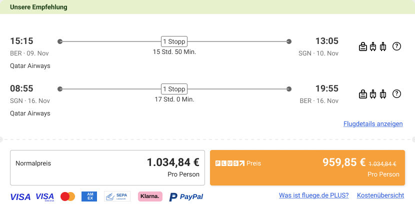
    Redesigned offer card: 'Unsere Empfehlung' banner, both flights on a compact timeline with baggage icons, normal price and member price as two equal buttons side by side

    Two equal choices. Both prices are their own button, in almost a third less height than version 2.

Three versions, same frame. The push toward the member price disappears, and the card gets compact again. The dashed line: the component is ready for what comes next. Click a card to see it full size.

My approach

I turned the card into an honest choice: two equal price buttons, side by side. I defined UX KPIs for the layout, A/B tested it against the previous card and checked real behavior in session recordings. I built the box as a modular component, so new features and layouts can be tested slot by slot without a redesign. The chip slot was planned from the start for features still to come, like the Flex Ticket in the next chapter.

Modular component

One box, four slots: top, itinerary, price actions and footer. Each slot changes on its own, so new features were added without a redesign and button layouts could be A/B tested. The tour plays one round, then it's your turn.

Interactive
Unsere Empfehlung
Flex Ticket verfügbar Kürzeste Reisezeit
21:40BER · 09. Nov
27 Std. 35 Min.
07:15SGN · 11. Nov
Qatar Airways
19:40SGN · 16. Nov
30 Std. 15 Min.
19:55BER · 17. Nov
Qatar Airways
Flugdetails anzeigen
VISAMastercardAMEXSEPAKlarnaPayPal
Try it: hover a stop, click a price

Controls
Price actions
Baggage

Result

A measurable conversion uplift, despite fewer upsell clicks. A less pushy offer sold more flights, and it is still live today. The test also surfaced ideas for the next round, ready to be tested in their own slots.

2 · Booking

The Flex Ticket: compare first, then a nudge

"What if my plans change?"

A flexible ticket lets customers cancel shortly before departure and get most of the price back. We A/B tested two layouts, iterated on the winner, then adapted it for the apps. Thanks to the chip slot in the Offer Box, the Flex Ticket also shows up right in the search results, without touching the card's design.

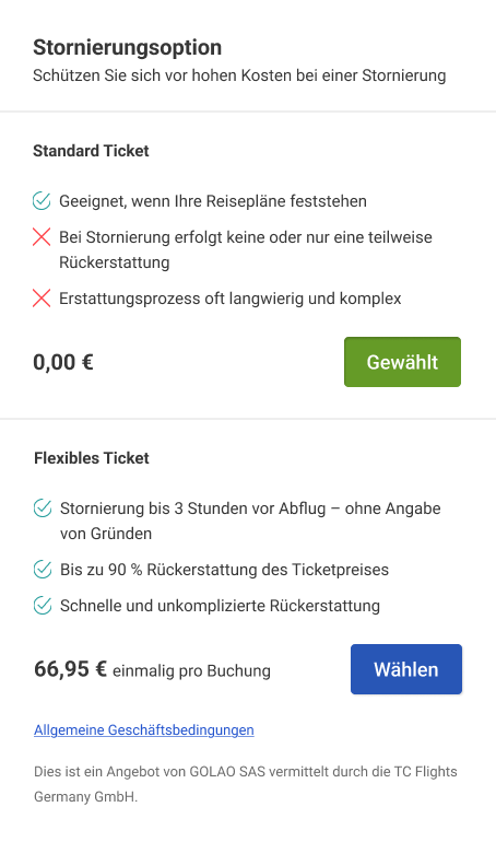
  1. Variant A · Vertical

    Matches the page

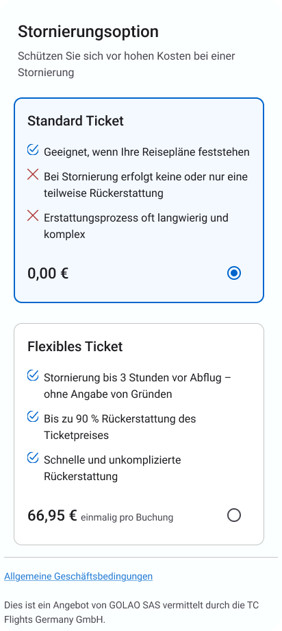
    Stacked like the other products on the page. The safe default, and our control.

    Variant A, vertical layout: the Standard ticket on top, the Flexible ticket below it, each with its benefits, price and button
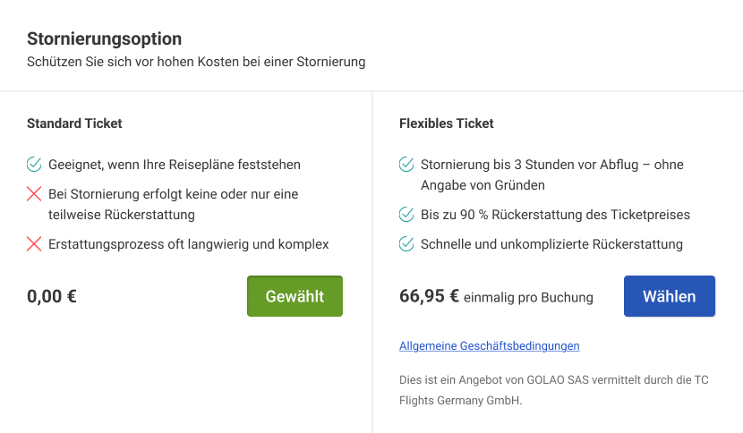
  2. Variant B · Horizontal Won

    Compare at a glance

    Ran in parallel to A. Our hypothesis: side by side, customers compare the benefits faster and pick the ticket that fits them. With the benefits lined up row by row, customers decided significantly better.

    Variant B, horizontal layout: Standard ticket and Flexible ticket side by side, so benefits and prices line up for comparison
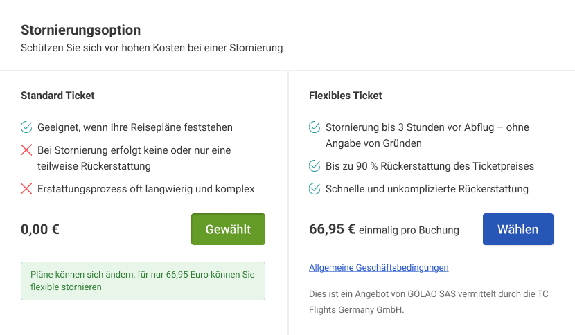
  3. Iteration · B with hint

    A nudge at the right moment

    Once someone picks the Standard ticket, a short hint reminds them that plans can change. It helps people judge whether the flexible ticket fits them, and it raised the take rate.

    Iteration of variant B: under the selected Standard ticket, a green hint says plans can change and offers flexible cancellation
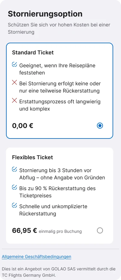
  4. Branch

    Variant A, reused in the apps

    We redesigned the booking funnel in the iOS and Android apps. Variant A's vertical structure became the bridge to the web: same content, same order, built within Apple's Human Interface Guidelines and Material Design.

    iOS

    iOS: both tickets as stacked cards with radio buttons, Standard selected

    Android

    Android: both tickets as stacked cards with radio buttons, Standard selected

Result

About 1 in 3 customers chose the Flex Ticket, and conversion rose by a high single-digit percentage. People booked who would otherwise have waited.

We also aligned design system decisions with the mobile development team. Web and apps now feel more consistent, and both teams avoid duplicate work.

3 · Payment

The Price Guarantee: the right moment, in plain words

"What if the price drops after I book?"

If the fare drops after booking, customers get part of the saving back as a voucher. We tested where in the funnel the offer belongs, then made the mechanics easy to understand.

  1. Variant A · Early in the funnel

    Next to the other add-ons

    Right after the contact details, next to offers like the Flex Ticket. The assumption: early means more attention.

  2. Variant B · At the payment step Won

    One decision at a time

    Our counter-hypothesis: once the other add-ons are decided, the offer gets full attention at payment. So we moved it there. With fewer choices on screen, customers decided with less cognitive load, and more of them took it.

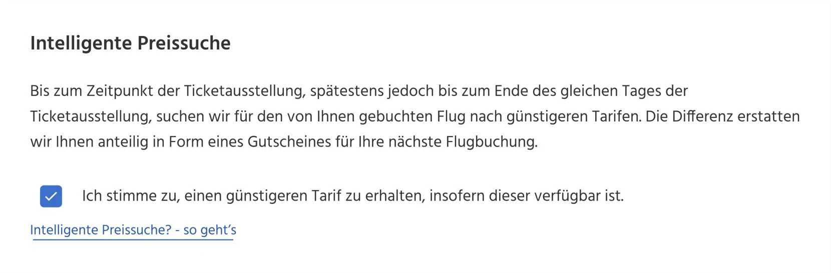
    Price Guarantee box at the payment step: heading 'Intelligente Preissuche', a short explanation, a checked box to receive a cheaper fare if available, and a link 'Intelligente Preissuche? so geht's'
  3. UX writing · How it works

    Explained in three steps

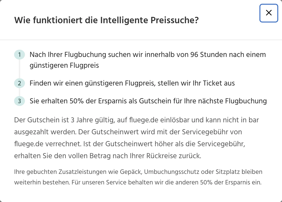
    The link under the box opens a short dialog: three numbered steps first, the fine print after. Customers see what they get before they decide.

    Dialog 'Wie funktioniert die Intelligente Preissuche?': three numbered steps (search for a cheaper fare after booking, issue the ticket, half the saving as a voucher), followed by the voucher terms

Result

Over a third of customers booked with the Price Guarantee.

What I would change next

Today the box ships pre-selected. I would make it an active choice: a guarantee customers pick themselves builds more trust, and trust is what all three features are about.

What I took away

Honest beats pushy, and the test decides

  • Measure the right thingA click is a means, a booking is the goal.
  • Trust beats tricksThe honest version won more than once.
  • Test your assumptions about placementThe best moment for an offer is not always the earliest.

Curious about the tests, the iterations and what didn't work? That's the part I like to tell in person.

Let's talk

Next case study

More to explore