Tobias Stoll
Product Designer turning complex user journeys into measurable business impact — across web and mobile.
Based in Berlin · Driving conversion and UX at Invia Flights ✈️
SELECTED WORK

Improving an Esports Platform Experience.

Designing a post-booking price guarantee.

Other Notable Work
Growth & Content Experiment
3,000+ followers · 1M+ views (2 months)
I use this channel to test:
retention & hook optimization
content structure & storytelling
performance-driven iteration

Who I am?
Product Designer based in Berlin with a focus on conversion-driven product experiences and scalable systems.
I work across web and mobile (iOS & Android), using KPIs, A/B testing and user insights to improve complex user journeys.
My experience spans e-commerce, enterprise and gaming platforms, where I design and optimize products with a strong focus on measurable impact.
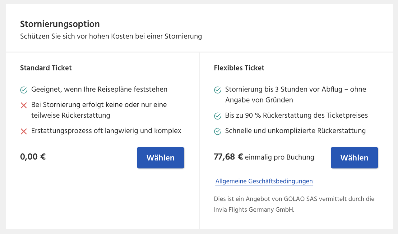
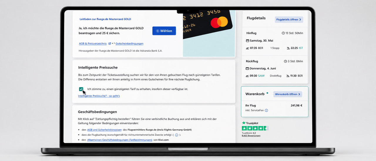
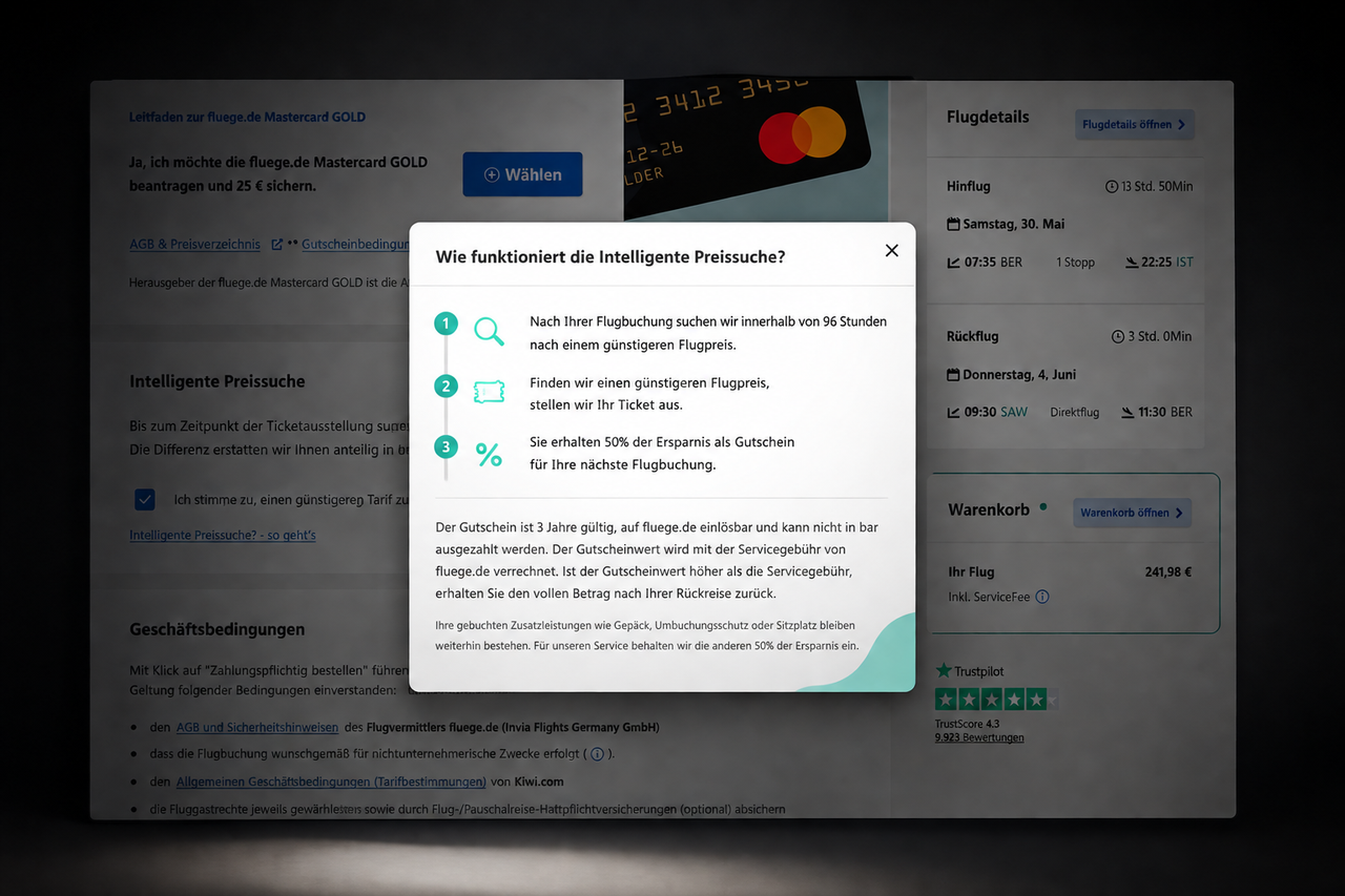
Designing a post-booking price guarantee.
Smart Price Guarantee at Invia Flights, turning post-purchase wait time into user value.

MY ROLE
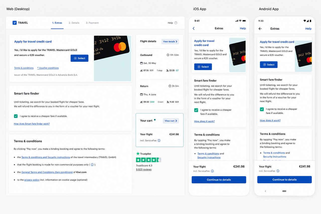
I owned the end-to-end concept and design of Smart Price Guarantee, an intelligent post-booking feature that turned the gap between booking and ticket issuance into measurable user value. As Lead Product Designer, I drove the concept from initial idea through cross-platform implementation across Web, iOS and Android, in close collaboration with Business Operations and a dedicated engineering team.
Concept ownership from initial product idea to validated production design
Cross-platform interaction design (iOS HIG, Material Design, responsive Web)
User research and behavioral validation to test trust and clarity of the offer
Close collaboration with Business Ops and Engineering on the price-tracking logic
CONTEXT
Invia Flights is one of the largest OTA providers in the german market, serving customers on Web, iOS and Android under different brands like fluege.de or airline-direct.de
Like all consolidated booking platforms, Invia operates with a structural delay between booking and ticket issuance, ranging from 1 to 3 days depending on airline and booking type. This delay is well known to users and is a common industry-wide friction point.

THE PROBLEM
Users knew about the 1 to 3 day issuance delay, but they had no way to act on it. If a flight became cheaper in those days, the saving simply went to the airline, never to the customer who already paid the higher price.
This created a quiet but persistent trust issue:
Customers felt locked into a price they couldn't influence
Price-watching behavior shifted attention to competitors
The post-booking phase was perceived as dead time, not value time
Trust was leaking at exactly the moment we needed it most
The challenge was clear: turn a known industry frustration into a competitive trust advantage.
DISCOVERY & MARKET POSITIONING
Before designing the feature, I conducted a competitive analysis across DACH and international flight booking platforms to understand how the industry was handling price uncertainty.
The pattern was consistent: most competitors offered pre-booking price watch tools that notified users when prices dropped, leaving the burden of timing on the customer. Some required insurance products to recover savings. None solved the problem after the booking was already made.
This reframe became the foundation of Smart Price Guarantee: an automatic, insurance-free, in-the-background mechanism that turned the 1 to 3 day issuance window from a vulnerability into a value proposition.
KEY IMPROVEMENTS
IMPACT
The feature drove measurable improvements in customer satisfaction, with post-launch surveys showing increased NPS and users specifically citing the price guarantee as a reason for trust in the platform.Internally, Smart Price Guarantee was celebrated company-wide as a flagship feature in All-Hands meetings, recognized as a successful example of turning industry friction into competitive advantage.
LEARNINGS
1. Trust UX requires zero compromise
When users see something that sounds too good to be true, transparency isn't a nice-to-have, it's the entire product. Every word of copy, every UI element and every flow had to answer "what's the catch?" before users asked it.
2. Native consistency means translating, not copying
Same logic, same trust mechanics, three platform-native expressions. iOS, Android and Web each had their own visual language and interaction patterns, but the user feeling had to be identical. Cross-platform design isn't visual matching, it's emotional matching.
3. Competitive analysis as strategic discovery
Without classic user research available, market analysis became the foundation for product strategy. Looking at what competitors weren't doing turned out to be more valuable than copying what they were.
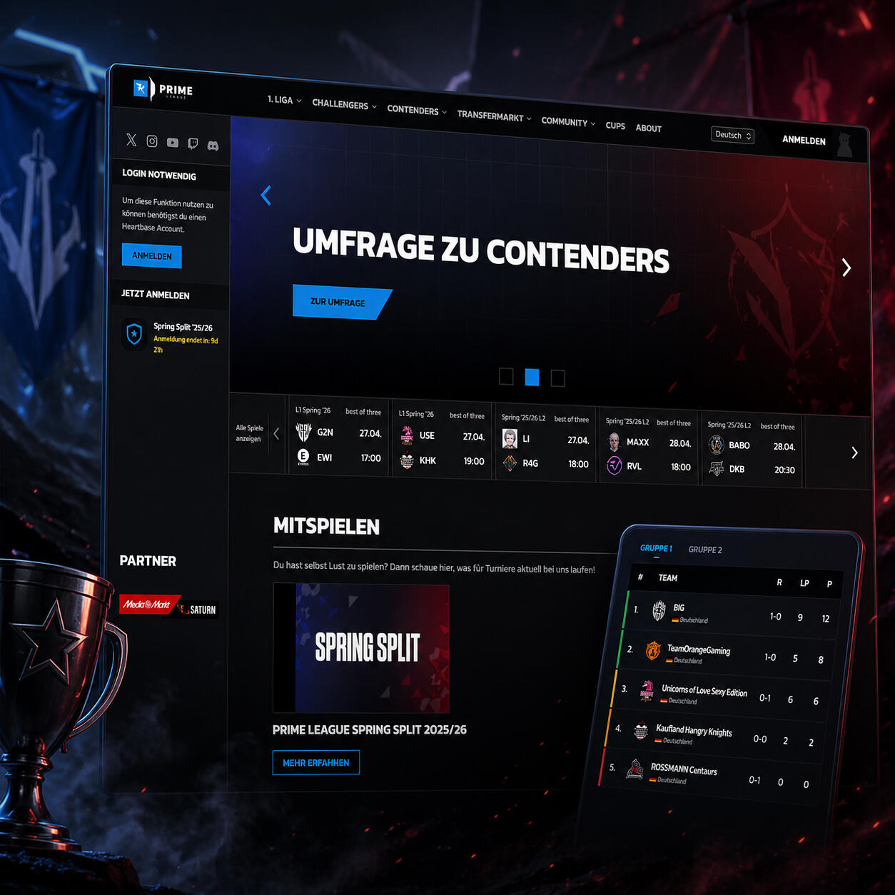
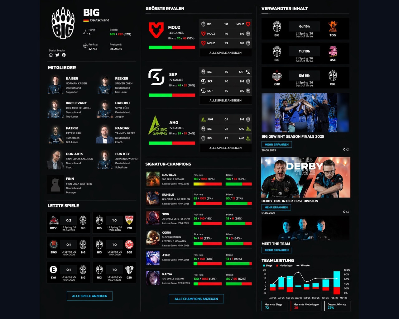
Improving an Esports Platform Experience
Designing a clearer and more scalable esports competition platform.

MY ROLE
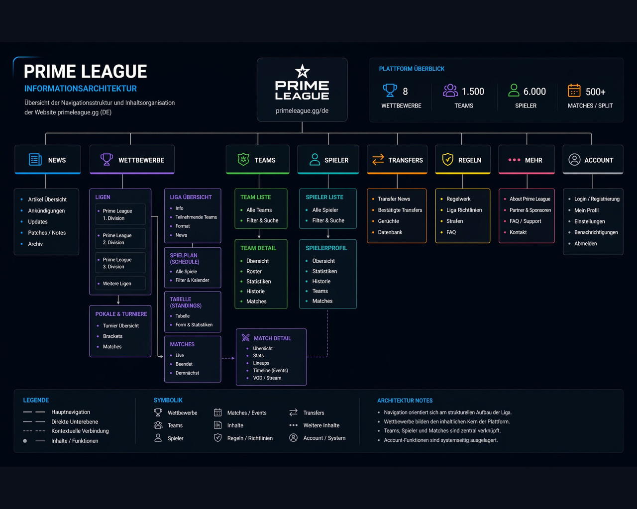
As the UX & product designer across 4 esports products serving 50,000+ users per season in the DACH region, I owned the full design process from research to shipped product. I drove key IA and product decisions in close collaboration with the team.
User research and behavioral analysis (Hotjar&GA) to identify key drop-off and navigation issues
Information architecture redesign to unify 4 fragmented product experiences
Interaction design and prototyping across web and mobile
Usability testing with real players to validate and iterate on key flows
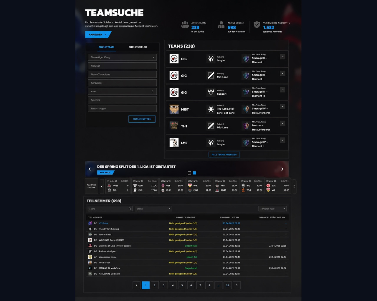
CONTEXT
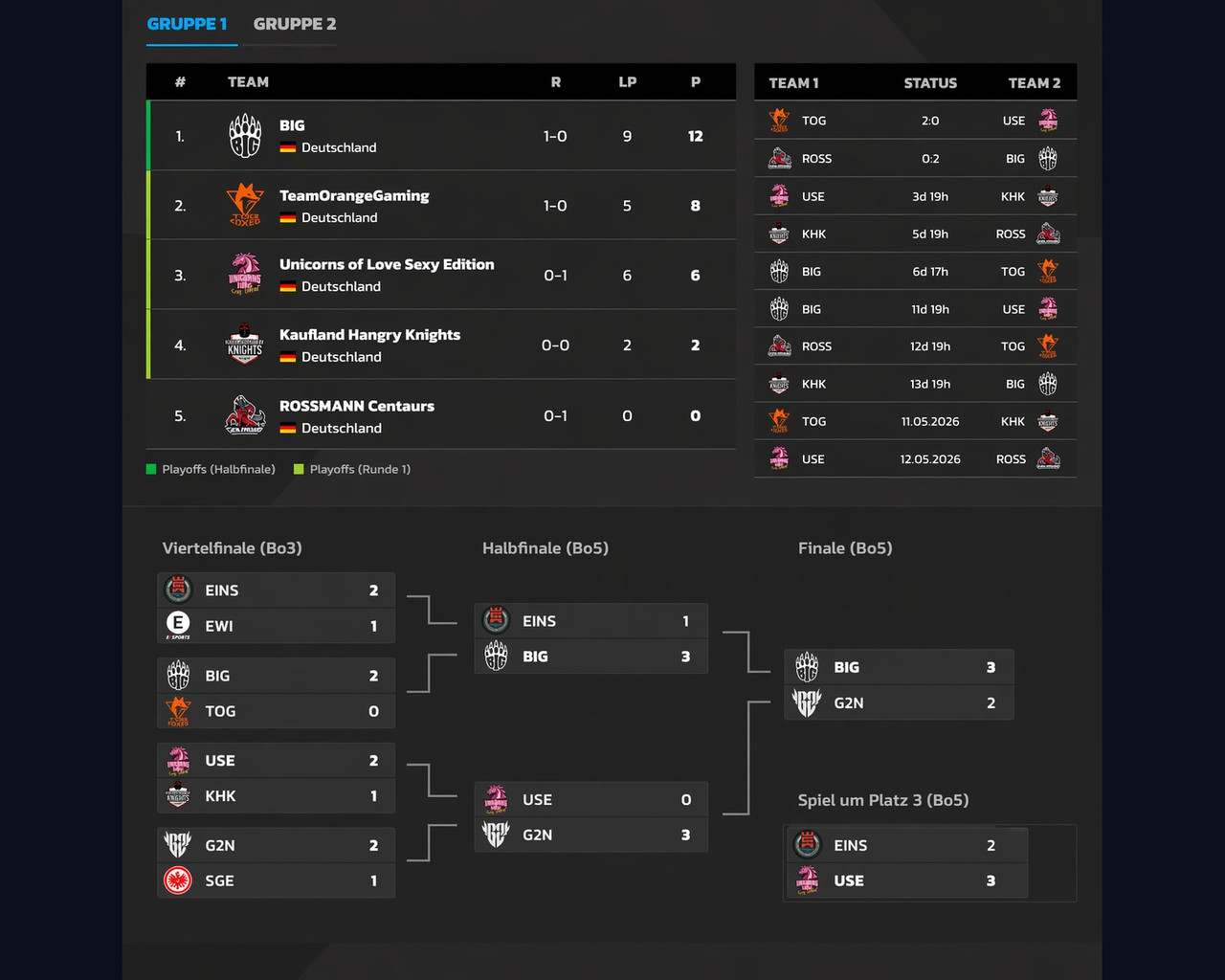
Prime League is one of the largest League of Legends competitions in the DACH region, with 1,500+ teams and 6,000+ registered players per season.
The platform serves three fundamentally different user groups:
Players: registrations and schedules
Teams: standings and opponent data
Spectators: brackets and live results
The same infrastructure powered 99Damage League and DreamHack Leipzig, making consistency across products a core design challenge.

THE PROBLEM
As the platform grew across 4 products, the experience became increasingly fragmented.
Navigation was built around league data models, not user intent. Users struggled to:
Understand tournament structures
Follow match progress
Explore team data and historical performance
Navigate between leagues, seasons and matches
RESEARCH & DISCOVERY
I combined four research methods: Hotjar behavioral analysis, Maze tests, moderated usability sessions and card sorting with 25 participants.
Hotjar behavioral analysis, unmoderated Maze tests, moderated usability sessions and card sorting with 25 participants.Hotjar revealed users were scrolling past key navigation. Usability testing surfaced the core problem: newcomers couldn't answer "When and where is my next match?"Usability testing surfaced a deeper problem: newcomers to the platform couldn't answer a basic question from the interface: "When and where is my next match?"
The bracket structure was built around league data models, not around what players actually needed to know.
The platform ecosystem included
multiple interconnected features:
league registrations
tournament brackets
team profiles
match tickers
live stream integration
league tables and matchdays
Improving the experience required restructuring how this information was organized and presented across the platform.

The original structure is driven by league data models.
This redesign shifts navigation toward user intent: competing, watching, and exploring.
KEY IMPROVEMENTS
IMPACT
LEARNINGS
1. Data beats assumptions
As a designer, I assumed the navigation problems were visual. Hotjar recordings proved otherwise: users knew where to look, they just couldn't predict what they'd find there.
That shift from gut feeling to behavioral evidence changed how I approach every problem since.
2. Three user groups means three truths
Players, teams and spectators used the same platform with completely different mental models. Early in the project I was designing for one generic 'user'.
Usability testing forced me to separate those perspectives, and the registration drop-off reduction of 30% was a direct result of that shift.
3. Set quantitative benchmarks from beginning
Looking back, I would have defined success metrics before the redesign, not after. We measured impact retrospectively.
Setting a baseline NPS or task-completion benchmark upfront would have made the outcome story significantly stronger.